Are you thinking about redesigning your website right now to tap into new trends driving more business? If not, then you should. Understanding modern web design trends can help make your website planning process easier.
One consequence of an increased focus on design as a means of effectively delivering content will be a stress on delivering said content to the right person at the right time—all with an eye to increasing desired actions, naturally.—John Moore Williams
Buyer Persona Focused Card Design
How well do you know your audience?
When was the last time you reviewed your buyer personas?
Your buyer persona profiles capture the demographics, behaviors, and specific needs of your target audience. These profiles are the foundation of your business as well as the foundation of your website’s user experience. The key to creating a unique user experience is allowing your audience to see themselves in your brand. So why not acknowledge them and their needs right off the bat through your website design.
Key Takeaway: Start with your homepage first. Develop how you want to feature your buyer personas, i.e, through images, animations, video, etc. Create a card based design around that idea. Then implement the design onto your website.
Once your homepage is updated with these new designs, be sure to analyze your homepage’s performance and compare it to what happened before and after the cards were implemented. Was there an increase in clicks? Which buyer persona cards were clicked on the most? With questions like these, gather the data and use it for future marketing and web design efforts—allowing your marketing strategy to be more targeted based on the data you are receiving from your website visitors.
Gifs (and animations) show a deep understanding of design and give a sophisticated touch to any website. We recommend using these on specific elements that you want to stand out such as, sales pop-ups, best-selling products and so on.—Wix
Offer Based Gifs and Animations
Usually used in email marketing campaigns, gifs and animations are visually eye-catching tools to capture your audience’s attention especially about future upcoming events or recent offers just like the example provided below:
In trying to decide if gifs and animations work for your business, ask yourself these questions:
- What do I provide my target audience?
- Do I provide products or services?
- Do I provide my audience with information—answering their pain points through my content?
- How do I distribute these products, services or information to my audience without it being salesy?
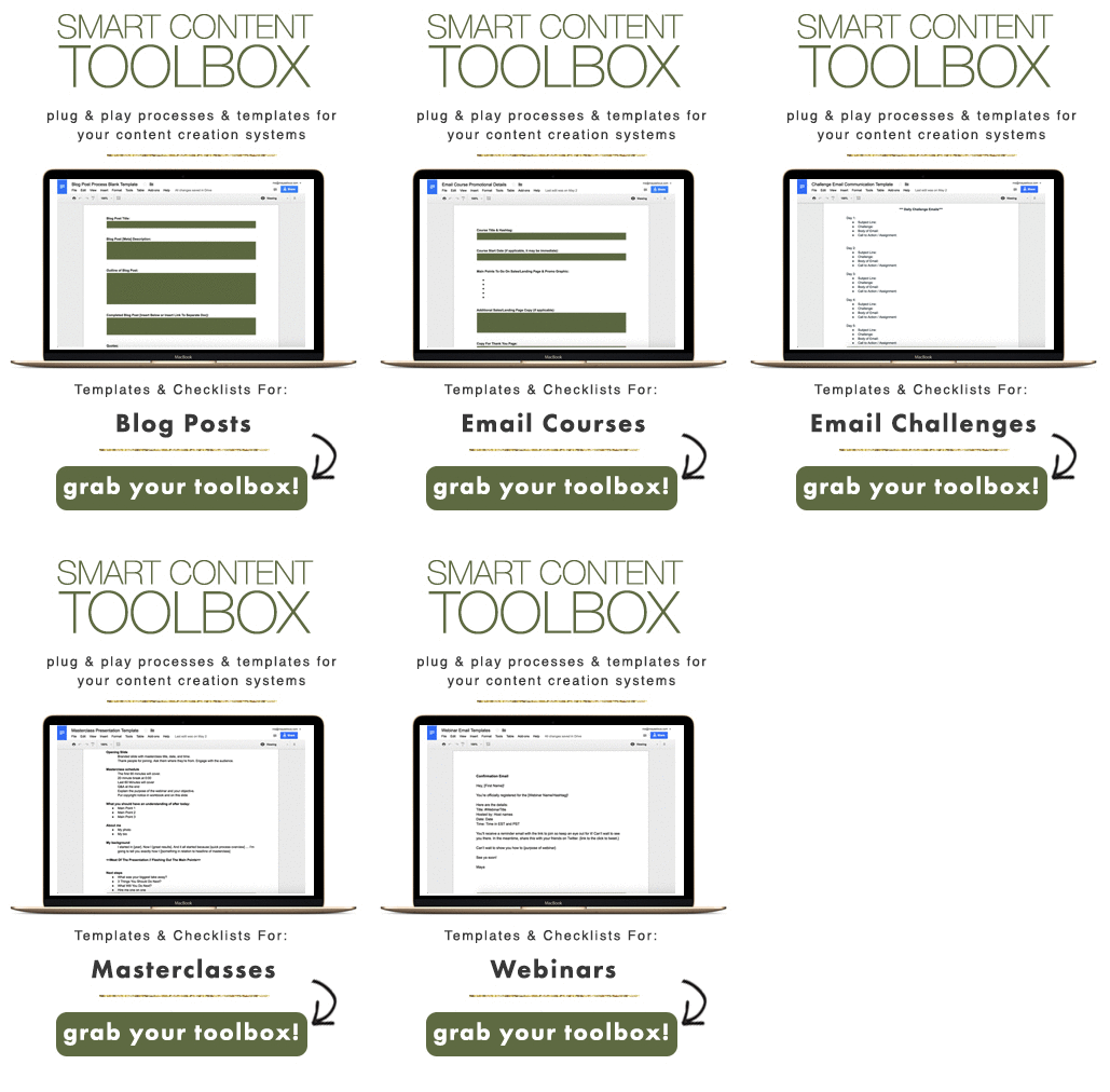
With your answers in mind, you can still benefit from using gifs and animations on your website. For example, if you mostly offer web based services, you can create an animated call-to-action (CTA) that features what you offer just like in the image below:
In this image, Maya Elious of MayaElious.com is a content strategist who helps bloggers, brands, and experts learn how to organize, strategize and monetize their content. In her sidebar, she features the above image as a call-to-action gif. Once clicked, it takes you to her Smart Content Toolbox product page where you can add this item into your cart and grab it for yourself instantly. By her using an animated call-to-action gif, you can see what you will expect from her Smart Content Toolbox upfront—increasing the value proposition within her users and within her potential customers.
So, whether you have a content offer or a sale on your products and services, show your audience the value upfront with animation and gifs in your website design.
Key Takeaway: Do not overuse this trend. You want to use this trend sparingly. Maybe use it for specific content offers or for new product launches. Whichever you decide, select one product, service, or content offer. Create an animated call-to-action either as a gif that features what the user will be receiving or as an animation that showcases your buyer persona’s needs being met through your product, service, or content offer. Then of course, analyze it. How many clicks did it receive in relation to your previous CTAs? How many of your website visitors converted into leads or customers based on your animated CTA?
Virtual Reality will likely be the most talked about design element…But moreover, you need to be ready to create virtual reality experiences that don’t require a headset. This includes website designs with 360-degree video and other highly interactive experiences with three-dimensional effects.—Carrie Cousins
For more information on modern web design trends to include in your website planning, check out the following infographic provided by Shortstack:
These are just a few easy design trends to jumpstart your website design process. When it comes to planning your website, don’t rush it. Take your time. Analyze your website. Find weak points. Pick one weak point. Create action items that will strengthen not only the design but also the user’s experience as well as your overall marketing efforts. Ultimately, just take your time, learn from your audience, and implement that data into a unique digital experience.
We want to know what consumers are looking for, what their values are, and how can we meet their needs. It’s not just about Big Data; it’s about translating that into the truth.—Gayle Fuguitt
Happy website planning!
Subscribe to our BLOG
Stay in touch & learn how to attract customers, become a thought leader, create effective marketing campaigns, & more.


 SOURCE
 SOURCE


