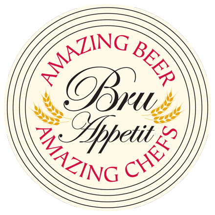
Our client, The Beer Channel, needed a logo design and an opening animation sequence for their show Bru Appetit. One of the biggest questions that faces our design team is how to design a business logo with 3D animation. So we created this mini tutorial. We first created several static comps of the logo and when we got sign-off, moved forward with animating the logo.
 We understood the client wanted the scene to look as realistic as possible. Producing this type of look in 3D can mean hours of work creating models and textures. Additional time is then needed to light and animate the scene, which entails making numerous rendering passes to get the correct look. In order to save time and money, we decided to place our animation onto a 2D photo background. Doing this, we would only have to model and animate our hero objects. The challenge was to merge our 3D models with the existing 2D photo as seamlessly as possible, matching the view angle and environment with the 3D camera and lighting tools.
We provided the client with a number of possible photographs to choose from, and it was decided to go with a professional restaurant kitchen look, which contained a lot of stainless steel fixtures and equipment. This had an almost black and white feel to it. The nice gray highlights would help us set off our more colorful 3D elements. Since the concept was to show beer within a food and cooking environment, we thought of placing the beer and food products on a cutting board atop of a stainless steel counter.
Based on disscusions with director Bill Knowland and the client, it was determined that we would like the animation to end on a close-up of the Bru Appetit logo, possibly on a beer coaster. As we thought about this some more, we came up with the idea of placing the logo onto a bottle cap, and having the camera move into an extreme close-up of the cap as the animation ends.
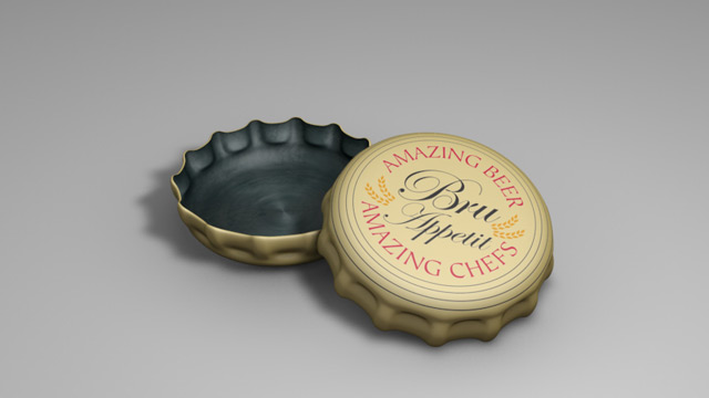
Having taken care of our background scene, we then moved on to the creating the foreground models and textures. Having the beer, glass and bottle cap look realistic against our existing photo was going to be the biggest challenge. We started with the bottle cap, since it would be our hero shot at the end. Since we had already developed the Bru Appetit logo in Adobe Illustrator, we were able to build a high-resolution texture and map it onto our 3D bottle cap model that would hold up in our close-up. We then rendered some stills of possible end shots for client to review.
The big challenge was creating beer in a glass, with a believable foam head and water drops on the glass surface. Getting a natural look for the foam took some testing and there was quite a bit of trial and error to get the right color, glass transparency, water drop distribution and initial lighting for the scene. Other foreground object included a cutting board, vegetables, bottle and knife. Some of the more problematic areas were in getting the chrome/ stainless reflection to look right in the countertop and knife. Adding the right amount of reflection without making it too “hot” or unnatural took time. We finally ended up with a kitchen scene with the beer and food elements that we thought worked well.
Since we had a limited amount of time to work on the actual animation phase of the project, we were determined to look for efficient ways to limit what we would be animating. The idea was to have an establishing shot of the kitchen work area with the beer and cutting board framed. We would hear the audio of a beer being opened and the bottle cap falling into the scene as the camera moves into the area where the cap lands. The beer foam in the glass spills over the rim as the camera moves in. The bottle cap bounces and then comes to rest in an extreme close-up of the cap with the logo on it. Using the built-in dynamics of our 3D program, we did a number of tests in order to get the drop-in, bounce, and ending position of our bottle cap, tweaking the settings until we got an end position that would really work well. We added another camera (which would be our main animation render camera), and positioned it for our ending shot. We did a low-res animation test to show the movement and framing to the client. After approval, we then “baked” the cap animation (this hard-wires the position points of the bottle cap flip into the file instead of relying on the dynamics interpolation that has to be rerun every time we play the scene in the program). Baking speeds up the playback and allows you to adjust individual positions in time if needed.
Now that we had our ending frame shot, we then reverse moved the camera into its starting position, which framed the whole kitchen scene. We knew that the move would be fairly quick (approximately 5 seconds), going from the wide-angle opening shot into the extreme close-up of the cap. This took numerous passes, adjusting the cameras motion-path, angle of view, and easing in and out positions.
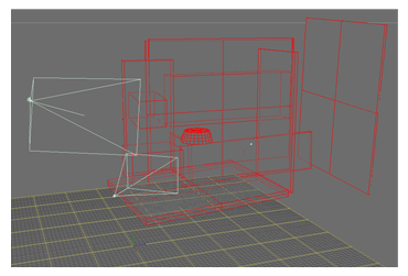
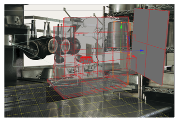
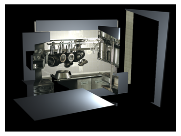
To give the logo animation more of a 3D look, we decided to simulate parallax as the camera moved closer to the foreground objects. We knew using some depth of field blur and adding parallax to the scene would give the 2D image a 3D “cheat” to make it more believable. |
To achieve this, we used “projection” cameras in our 3D program to project the background kitchen scene onto simple geometric shapes placed at different distances in our 3D scene. We took our background image into Photoshop and cut out different images in the picture that were located at different distances from the camera and placed them as separate layers. |
In our 3D package, we loaded the images into our projection cameras, looked through the cameras to position them accurately and built our 3D geometry to project the images on. We then did some more sample renders with our main hero camera to see how this was working. |
After several more low-resolution animation tests to check the camera movement, cap motion, and beer foam animation; we finalized our lighting and made final tweaks. To add natural lighting highlights and reflections, we applied a kitchen environment HDRI file to a sky object. The HDRI file is a high-resolution spherical photograph taken in an actual kitchen setting. The reflective qualities of a number of the textures in the scene were set to take advantage of the sky object.
The Beer Channel owner, Carlo Overhulser summed up the experience:
“The first thing that told me Direct Images Interactive was for us was the incredibly professional work without an intimidating attitude. They kept a direct line with us throughout the creative process and the end result was far better than we had envisioned. It quickly became an easy choice to stay with Direct Images for all of our logos, animation, and other multimedia needs. First in class service, experience, and end product.”
As you can see creating a 3D animation does take a bit of legwork and know how. It doesn’t however have to break the design budget to get the results you are looking for.
Editor’s Note: This encore blog was originally published in August 2013 and has been updated.
Subscribe to our BLOG
Stay in touch & learn how to attract customers, become a thought leader, create effective marketing campaigns, & more.

