Despedida! Adeos! Au revior! Ciao —the year of mobile expansion and video is now! Here are 13 smoking hot trends that are bursting on the mobile web design scene.
You asked and we’ve heard you. Hot off the presses, read all about the top trends for mobile website design.

Wondering what mobile website trends are in and hot right now? Trying to stay abreast and ahead of the curve are we? Well as always @directimages has got you covered.
Before jumping in we recommend viewing our short video on What is Modern Design.
And now, Check out these 13 new mobile website trends and feel free to adopt a few or all (go ahead and be greedy) of these tips.
1. Parallax Scrolling
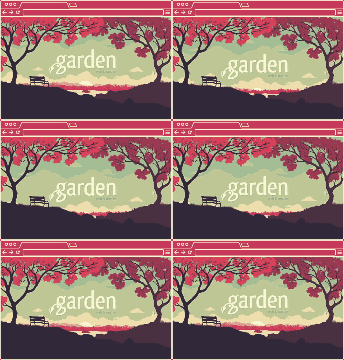
Traditional scrolling is limited to horizontal direction only. The Parallax movement is attractive due to the movement of background features amidst traditional scrolling. Certain parts of the background scroll independently of the main screen. If those definitions still seem to have you scratching your head a bit think of parallax scrolling this way:
The visual effect of your background image moving slower than an image placed on your foreground.—wix.com
Here are a few sites that are using parallax scrolling. Check out how cool these look on your mobile device. It’s as if it is optimized for tablet and mobile viewing:
2. Infinite Scroll
The infinite scroll is not necessarily a new trend yet it is still steaming up our web pages. Similar to parallax scrolling, infinite scrolling seems to be optimized for longer page visitation and responds smoothly for mobile devices.
One of the most known sites using infinite scrolling is no other than:
Another great example:
3. Blurred Images
Yes, that is correct blurred images. Images slightly out of focus have displayed website backgrounds creating for an overall enhanced professional look and feel. It is important to note the difference between pixilated images and blurred images.
Check out the following link to see blurred images used in real time:
Use a high resolution photo and blur it slightly out of focus to enhance the written text you want to draw your viewer’s attention to. It is a clever way to still incorporate dynamic images that enhance your presentation while also not making the image a focal point distracting from your written messaging.
This can become increasingly important for mobile as the screen is limited. It’s a real game changer when you can direct your viewers’ attention directly to the areas that matter the most.
4. Swipe photographs
We are confident that you’ve heard of jokes mentioning terms like “swipe left” or “swipe right.” Here we are talking about images on your website that automatically move. You can also think of images that seem to be sliding or self-scrolling across your page.
This is also a great way to draw attention directly to the information you want the viewer to see. It is interactive and dynamic all at the same time.
Here are some examples of this trend in action:
5. Interactive images and animation

This is extremely popular and functional for many businesses. Every national holiday, fun national seasons (such as the summer Olympics) and during key moments on our calendar (such as Chinese New Year) Google will have an interactive header on their search engine. Other sites that do well with interactive animation are car websites that allow you to build a model with immediate display right on their site. These features are also responsive and adapt to mobile screens.
How can your business get in on the action? Look at investing in Javascript or someone that has it as a strength to enhance your mobile web user experience.
This trend and a few others are carrying over from prior years, which is good news as it shows some design consistency. Happen to miss our video on design trends? Check it out below:
6. Typography
Bold, stylistic typography is being used increasingly over the years. Current trends are pushing the envelope on typography. Just take a look at Google. The actual stylistic display of the word “google” has changed in variations over the years. And now, over 20 years later Google has a fresh stylistic typography that is inclusive of a sleek yet bold trend.
Designers are pushing the envelope on bold mixed fonts, letter shapes, colors and even digital textures. While video and images are still important, designers are starting to place more artistic design in words to draw in attention to the overall message.
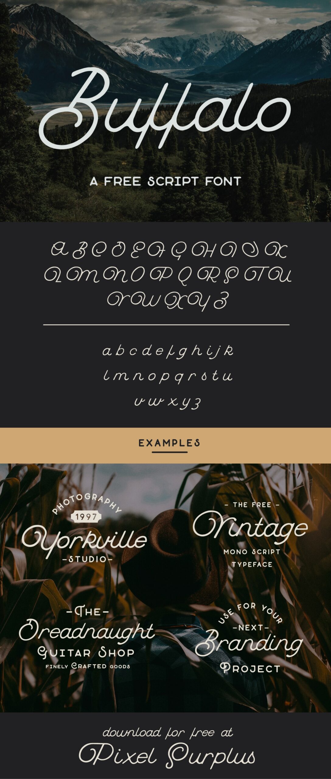
Checkout this really cool free font optimized for bold titles and headers to enhance your mobile web designs.
7. All caps navigation (in bright, fair/air colors) in smaller fonts
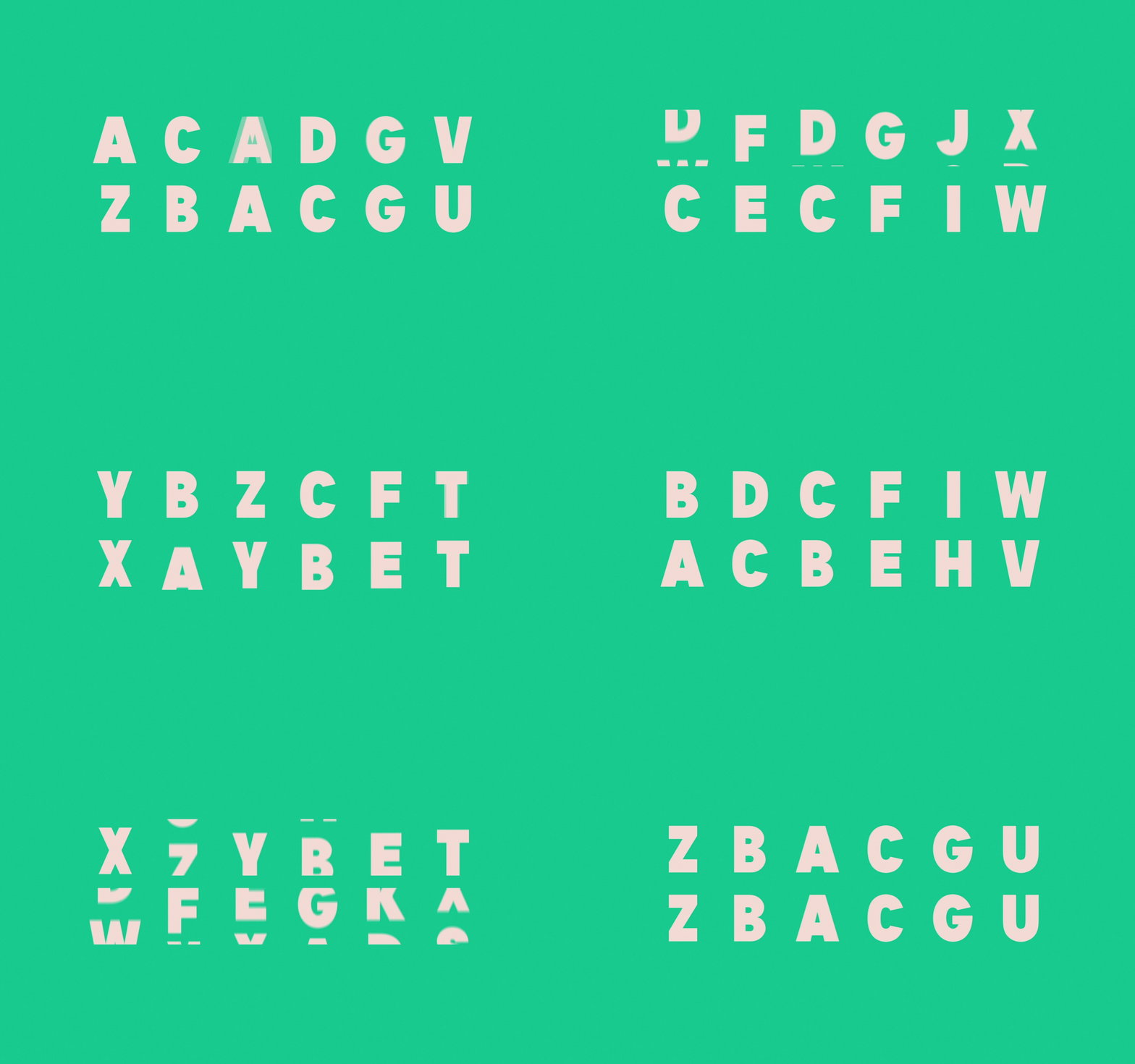
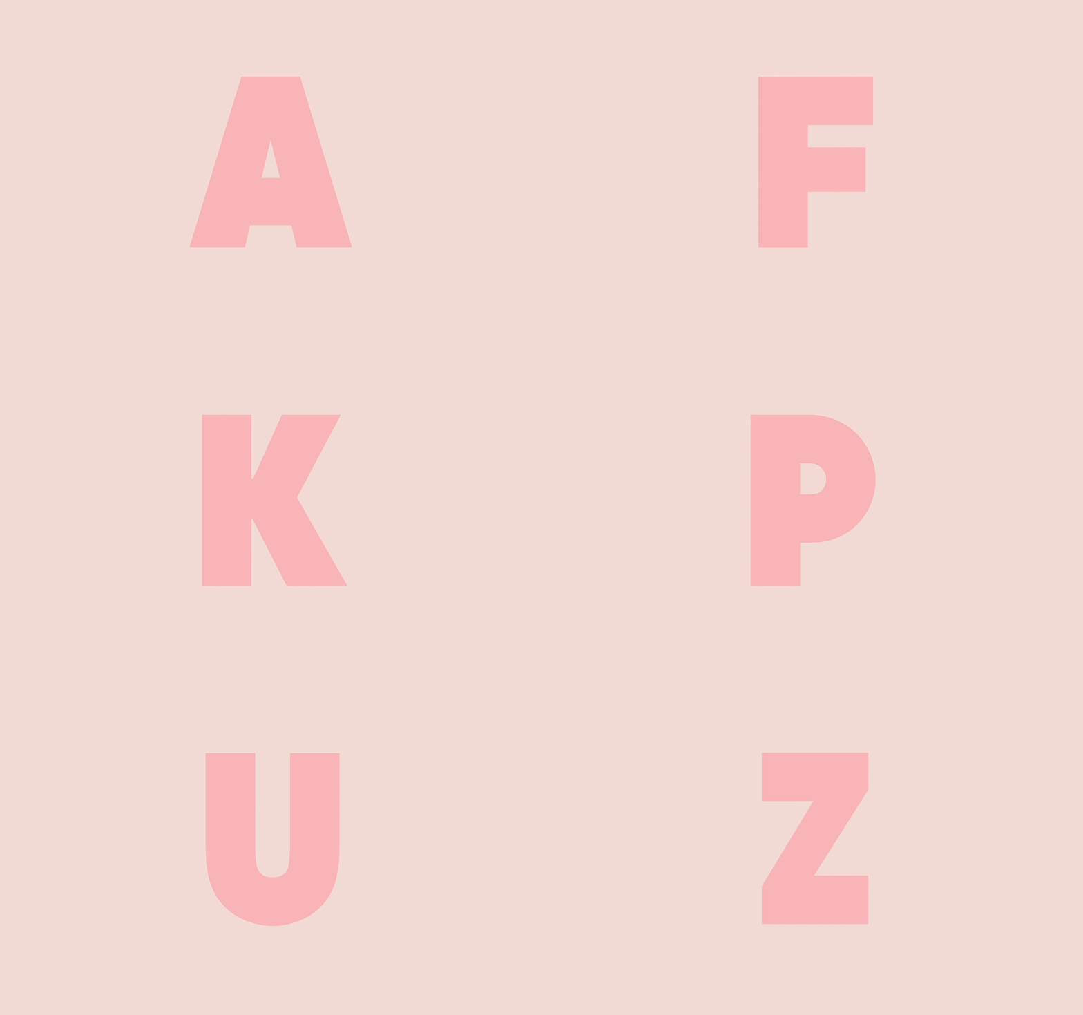
Second along with bold typography, there is a developing trend of all capital letter navigation sections in smaller fonts and bright colors. Checkout these animated examples below.
8. Hidden Navigation Bar vs. Dot Navigation
Speaking of a navigation bar, you are finding both in mobile and traditional web designs that navigation bars are becoming more less of a focal point on the content page. Instead we see dot navigation and hidden navigation bars. This frees up the navigation space to add text or maximize images.
This is also extremely functional for mobile as one does not have to expand the website page to select where you would like to go on a site. Instead you can just swipe over a navigation button or select a left hand corner dropdown tab to identify the navigation bar.
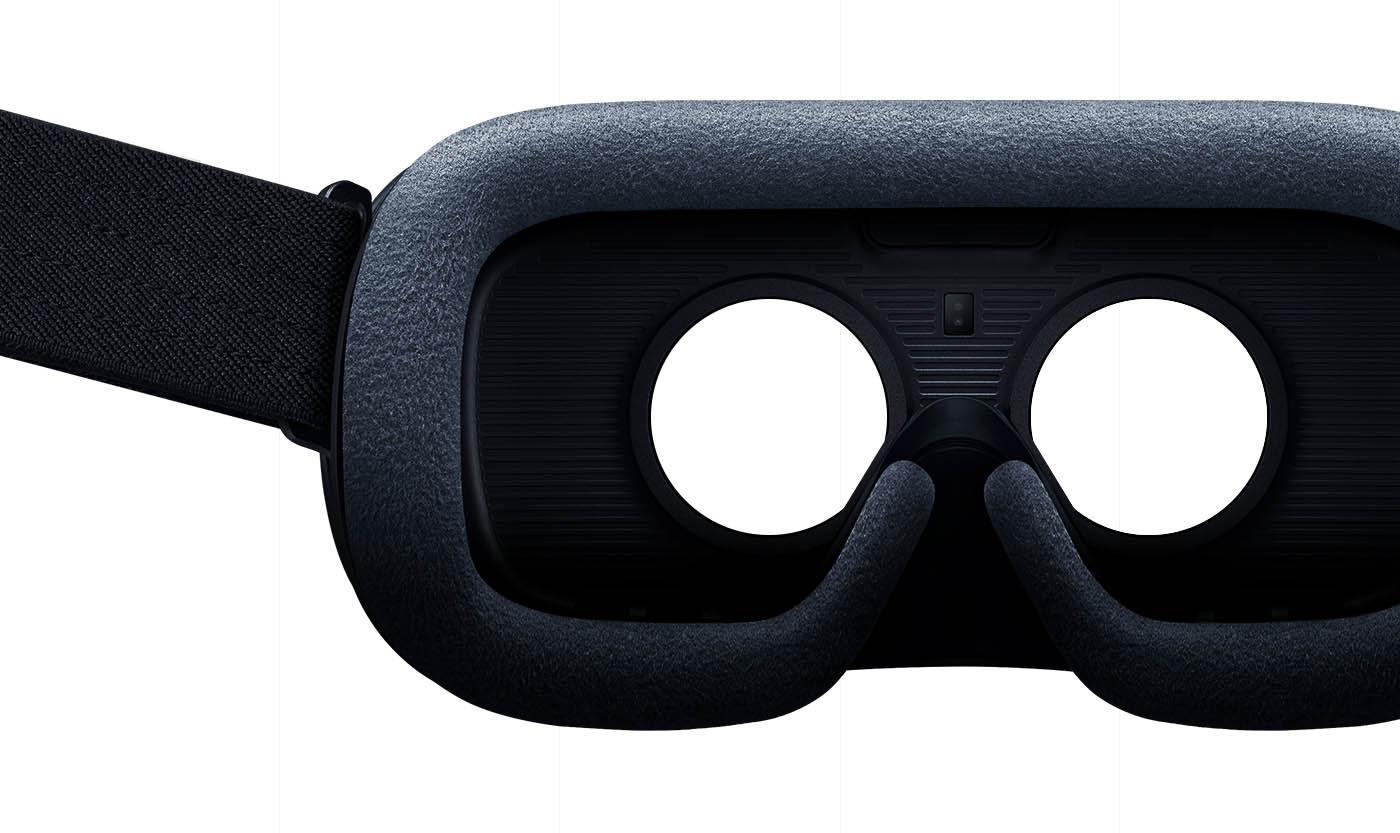
9. VR and 360 video
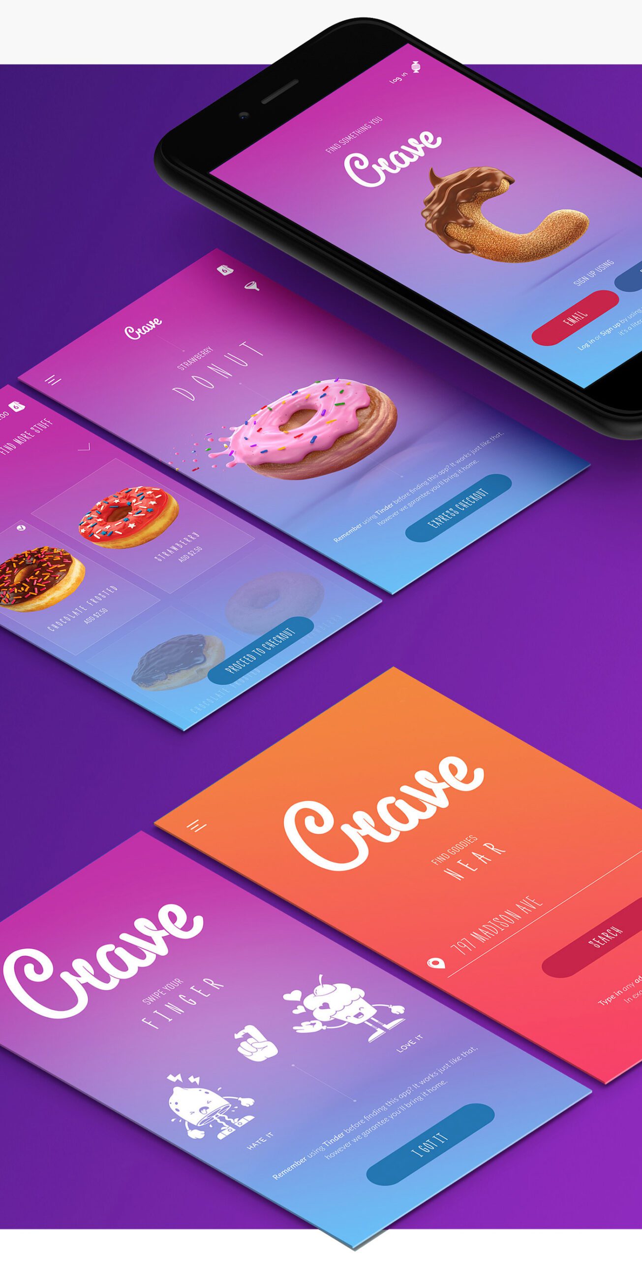
The much anticipated and most buzzed about word in new media is VR. Many consumers and professional marketers have been eyeing virtual reality for many years now. It appears with releases of new video games that VR is here and only growing in it’s adaptation to many industries.
You may be thinking, yes VR it sounds really exciting but how can I incorporate it in our mobile website experience?
Well, actually VR is compatible with mobile devices such as most smart phones. Once a strategy is identified on how VR can enhance your buyer’s journey it may be worth investing in a virtual reality experience for your users.
Just checkout how the New York Times is enhancing their user experiences through virtual reality.
10. Card design and Grid layouts
Number 10! Whew! Any creative ideas flowing to you on how to enhance your mobile web design? We hope that you are finding this blog post valuable. Our next trend involves card and grid designs.
We have seen this trend mostly with fashion and consumer product brands. Nevertheless it is adaptable to many industries. Checkout our sample below.
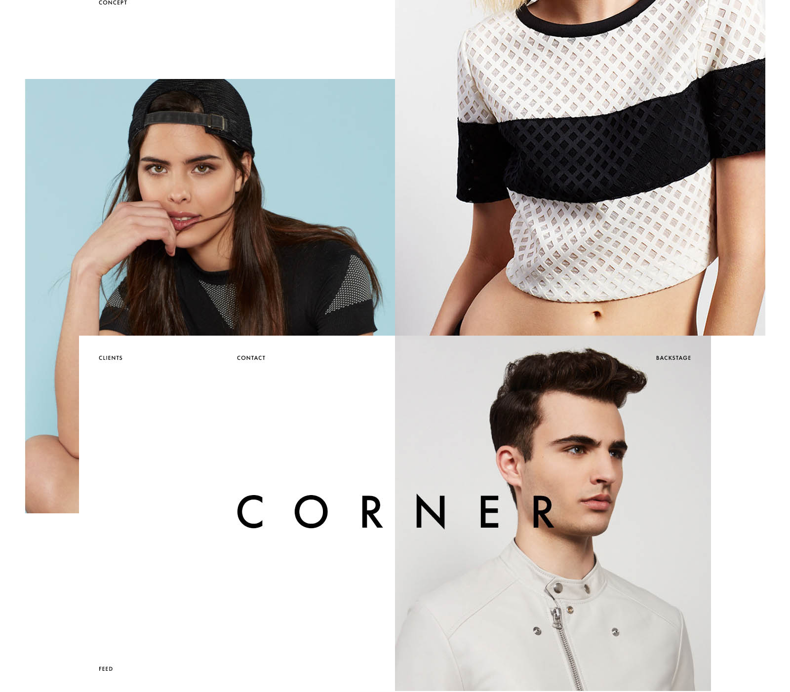
Perhaps for your product or service it works best to set content in juxtaposition with one another on your website. There are many advantages for card/grid design. Think about your buyers needs and that will help you determine which style works best for you.
11. High quality authentic photography

We are moving away from traditional stock photos and shifting towards high quality authentic photos. There is something about photography captured by humans. Photos that capture smiles, laughter and grit that really resonates with your prospects. There are lots of great online websites that are free resources to businesses helping them collect copyright free authentic photos.
For example checkout:
12. Vertical navigation
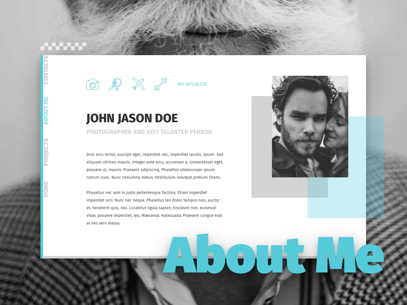
Interested in a vertical navigation design style. This format places all of your navigation content to the left or right side of your viewers screening device. Particularly for mobile users having content accessible via the left side of their screen is beneficial as it is easier to navigate.
Checkout the sample of this below:
13. Split screen
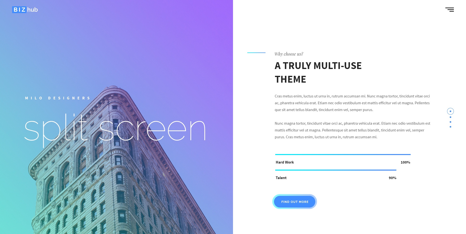
Lastly, for our design trends, we present to you the split screen design. Checkout the unique homepage design below. Spice up your business or personal homepage with bold colors, sleek navigation and experiment with split screens via color blocks or images. This is a fun subtle way to retain and engage viewership without jumping into animation and (for some) complex javascript code.
So what do you think of our design tips? Any stand out to you? Anything that you think we missed? Talk to us and don’t forget to tag @DirectImages we are listening.
Who knows your question may impacts our next blog post. After all we are here to help you, so let us know what you need.
Subscribe to our BLOG
Stay in touch & learn how to attract customers, become a thought leader, create effective marketing campaigns, & more.


